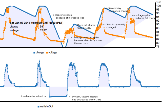
The orange line above represents the voltage across the battery during the time when the solar panel is charging (voltage peaks), and also during the time when the battery is discharging (voltage valleys). On the top chart, the blue line represents the percentage of the total energy remaining in the battery (like a gas gauge in a car). This is the line that should never fall below 50% in order to get longer battery life.
Voltage is like pressure, when a person is blowing up a ball. When the ball is deflated, it only takes a little pressure to fill the ball. but when the skin of the ball is tight, the ball does not get any bigger (the battery does not get more charged), but the pressure just goes up.
The charge controller limits the amount of pressure , and the time that pressure is applied. The flap top of the voltage curve is just about 2 hours long.
In the above graph, the blue line shows the flow of energy into and out of the battery (energy is measured in watts, which is the product of voltage times current). So it is really the flow of electrons into and out of the battery (the current) that is important (the voltage remains pretty much the same).
In the above graph, the shape of the blue line tells a lot about the sun, the solar panels, and the battery. During the second day, it was mostly sunny, but a cloud drifted across the sky about 11am. During most days, the battery becomes charged about 12 oclock, and the solar controller cuts down the charging, to keep from turning boiling the battery dry. But on the day after the load resistor was left on overnight, the solar panel was charging as much as it could all day, and the shape of the “wattsinout” was a smooth mountain.
